
How can businesses optimize their website’s mobile responsiveness for better user experience in digital marketing?

How can businesses optimize their website’s mobile responsiveness for better user experience in digital marketing?
Optimizing a website’s mobile responsiveness is crucial for providing a better user experience in digital marketing. As mobile usage continues to grow, businesses need to ensure their websites are user-friendly and visually appealing across various mobile devices. Here are some tips to optimize mobile responsiveness for a better user experience:
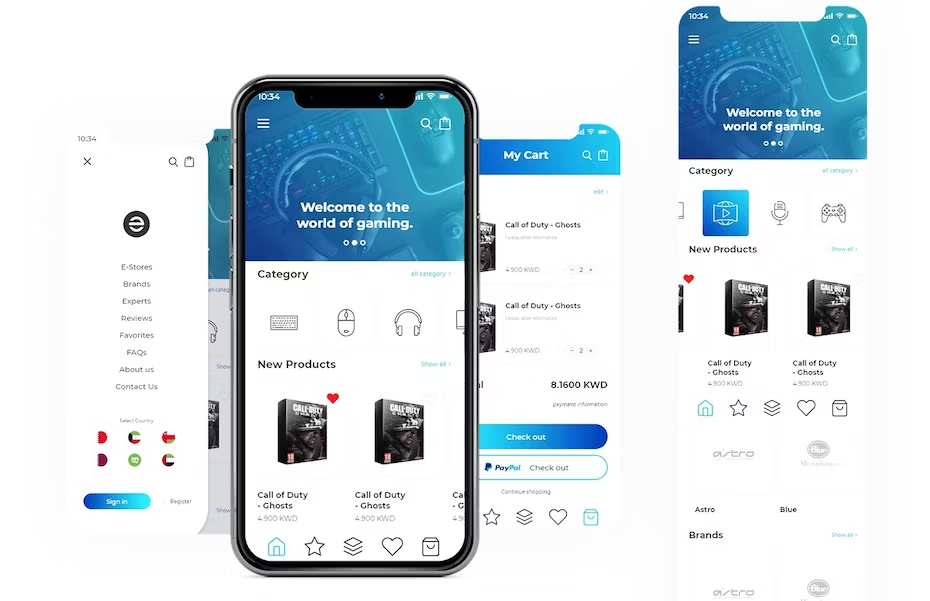
Responsive web design: Implement a responsive web design that automatically adjusts the layout and content to fit different screen sizes and orientations. This ensures that the website looks great and functions well on smartphones, tablets, and other mobile devices.
Mobile-friendly navigation: Simplify navigation for mobile users by using a clear and intuitive menu. Use a hamburger menu or other mobile-friendly navigation styles to make it easy for users to access different pages on your site.

Optimize page load times: Mobile users expect fast-loading websites. Compress images, minify CSS and JavaScript files, and leverage browser caching to reduce load times. Tools like Google PageSpeed Insights can help identify areas for improvement.
Streamline content: Focus on concise and relevant content for mobile users. Avoid large blocks of text and use bullet points, headings, and shorter paragraphs to make it easier for users to scan and find information.
Optimize images: Use optimized images for mobile devices to reduce bandwidth usage and improve loading times. Consider using modern image formats like WebP, which can significantly reduce file sizes without compromising quality.
Mobile-friendly forms: If your website uses forms for lead generation or other purposes, ensure they are mobile-friendly. Keep the number of fields to a minimum and use appropriate input types for mobile devices (e.g., date pickers, numeric keypads).
Test across devices and browsers: Regularly test your website on various mobile devices and browsers to ensure consistent performance and display. Emulators and testing tools can help simulate different devices without the need for physical testing on each one.
Implement touch-friendly elements: Make sure buttons, links, and other interactive elements are easy to tap on touchscreens. Provide enough spacing between elements to avoid accidental taps.
Use mobile-optimized fonts: Choose fonts that are easily readable on smaller screens. Stick to standard web-safe fonts or consider using web fonts designed specifically for mobile devices.
Avoid Flash and pop-ups: Flash is not supported on many mobile devices, and pop-ups can be intrusive on smaller screens. Opt for HTML5 and consider alternative ways to present important information.

Mobile SEO: Ensure that your mobile website is properly indexed and optimized for mobile search engines. Mobile-friendly websites are more likely to rank higher in mobile search results.